Delta – Custom Internal Management SaaS
Year
2018
Industry
SaaS/Tech
Description
Delta offers customized company management SaaS software. This project entry explores my contribution to one the projects they serviced. UX case details below.
Goal
Design a Web App to help the company manage all their administration issues in order to better control and prevent losses due to inefficient management.
Methodology and Development Medium
The stakeholders had chosen the working methodology and development medium from the beginning of the project so there wasn’t any weighing in involved on my part.
Problem & Strategy
Main Problem:
There is limited staff to manage all the different branches of administration that the company deals with and this results in poor management and therefore in unnecessary losses. Thus the solution involved creating an app that would help a user get a “bird’s eye view” of the situation at any time and unburden the user from as much manual track-keeping activities as possible.
Strategy
Taking into account the goals and budget of the stakeholders, I put together a strategy for the UX phase.
Research
Since this was an internal use application, the research phase wasn’t as extended as for other projects. The budget for the project as a whole was limited so I proposed that we limit our research to the company staff since that would provide a good amount of insight at zero costs. I conducted some interviews with the main employees that will or might use the app in order to determine what problems they are currently facing and what the solutions to those problems might be.
Since the future users were already known, there wasn’t much sense in creating personas. I did however grouped the employees into categories based on their department in order to gain some perspective into all the different professionals that will use the app.
Balance
One problem that the stakeholders faced was that a company of a fairly big size like the one in question has a high number of different issues to deal with on a daily basis. Adding functionality for all of those issues would have meant a bigger budget than the one proposed and a longer development period.
The solution was to start with an MVP : work through all the possible different features and figure out which ones play a bigger role in reaching the goal, then post-development, if necessary, we will repeat the process and add more features.
Methods
Affinity Diagram
In order to identify the most important features the app should have, I set up a group session with all the stakeholders and asked them to propose features that they believe would be useful. We then proceeded to group these features by similarity to form clusters. This helped show the main areas of interest. In order to reduce the feature clusters to a few features, I asked the group to weigh in and compare all the features of a cluster among themselves. Taking the first one and ranking it against all the others, and then repeating the process for all the remaining ones until completion. This achieved two results: it opened up communication and mutual understanding among stakeholders and it lead to establishing a hierarchy among the features.
Information Architecture
Once we had a list of features, they needed to be properly organized in order to be easily accessible both for current employees and for future users. Since the terminology is very specific, I asked the group to weigh in again. I divided them into a few groups and asked each group to place all the features into categories and name every category. This helped determine the most common terminology and their expectations.
Wireframes, Mockups & Prototypes
Based on all the information I gained, I created some user flow graphics and a set of low-fi wireframes. After getting them validated, I created some muckops based on the wireframes which I used to build a working prototype.
Usability testing & UI design
Usability testing
I ran some in person tests with the users I identified during the research phase. I made up a list of tasks for them to complete and watched them perform the test. I reiterated my original designs a couple of times before validating them fully.
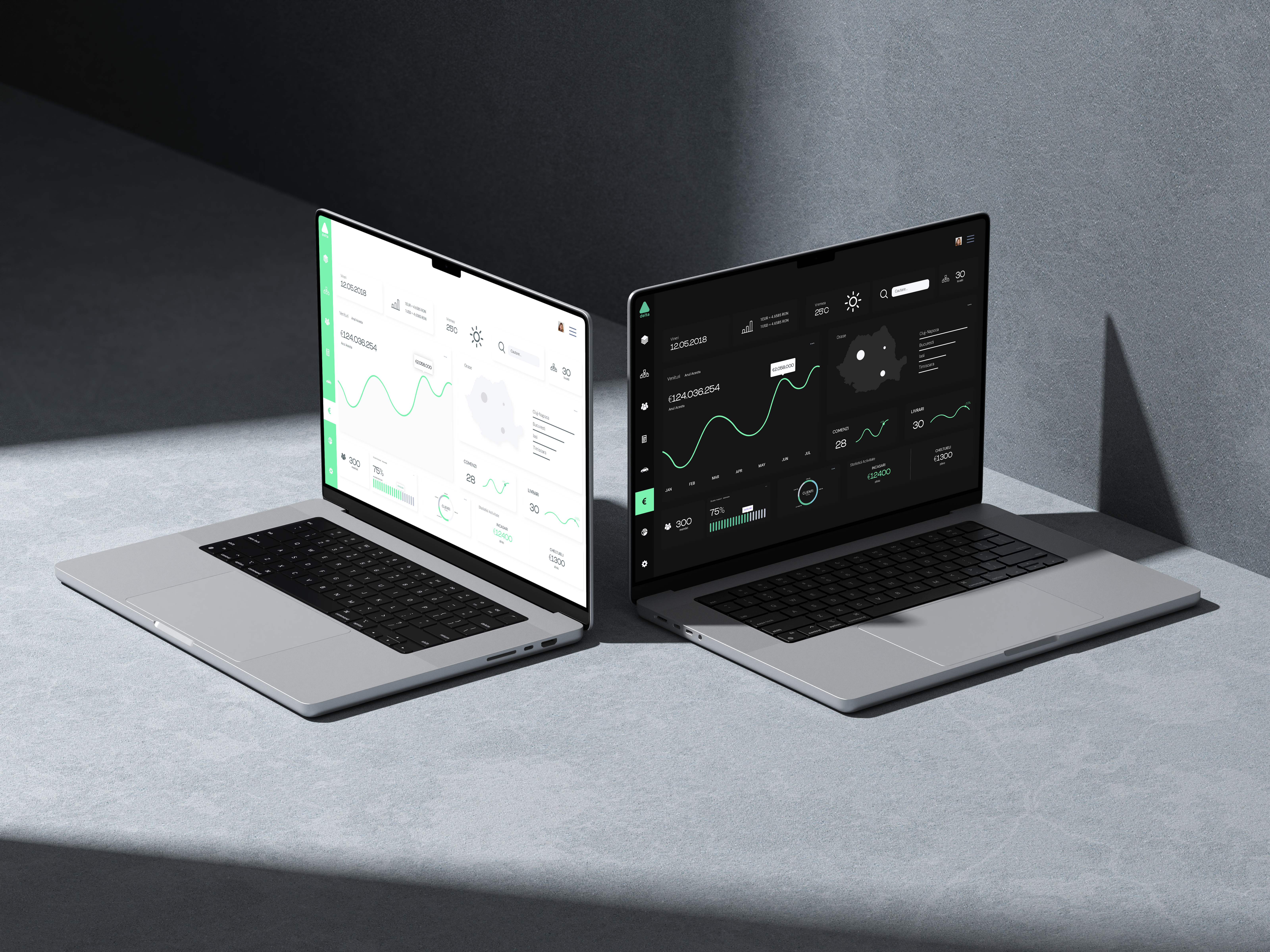
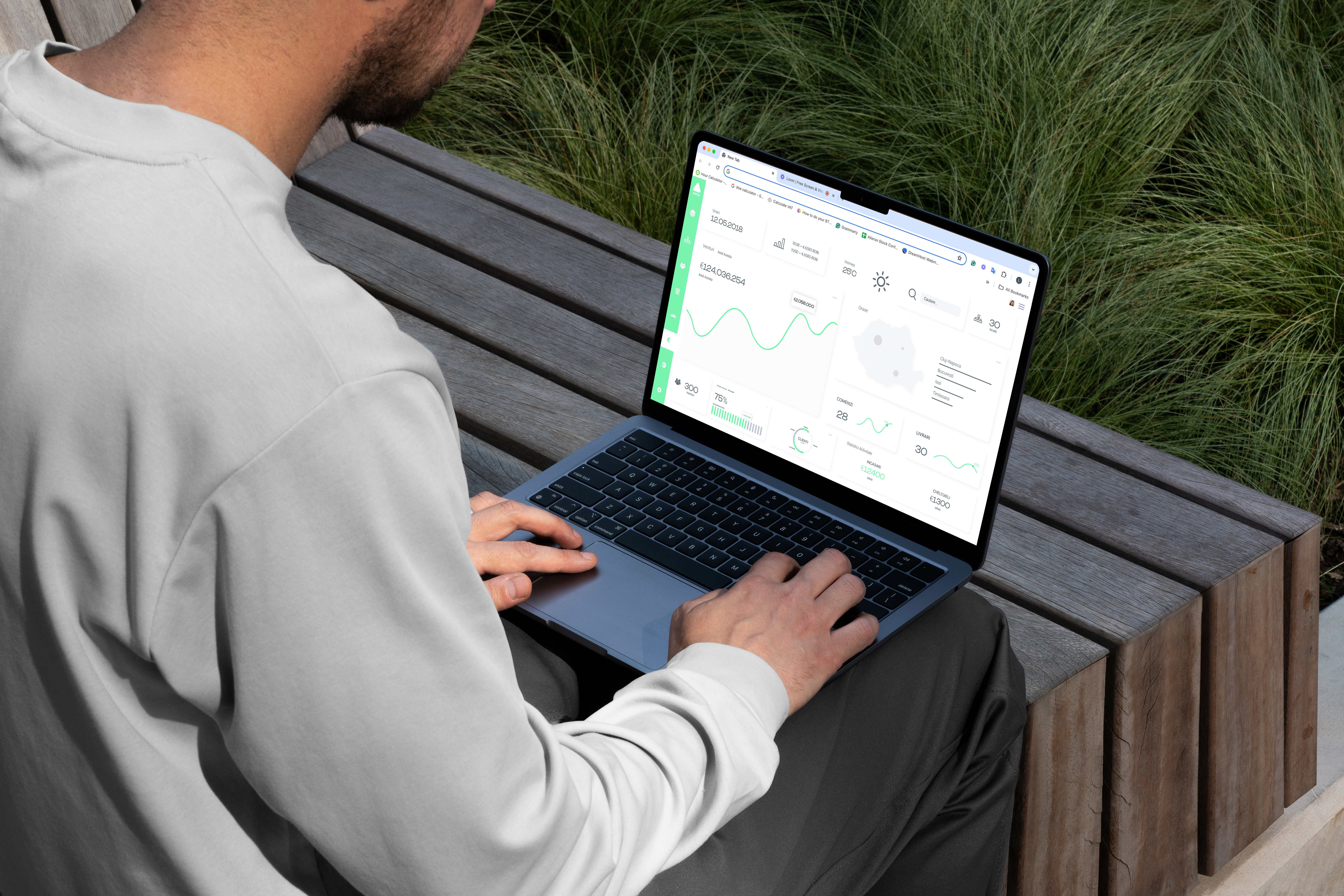
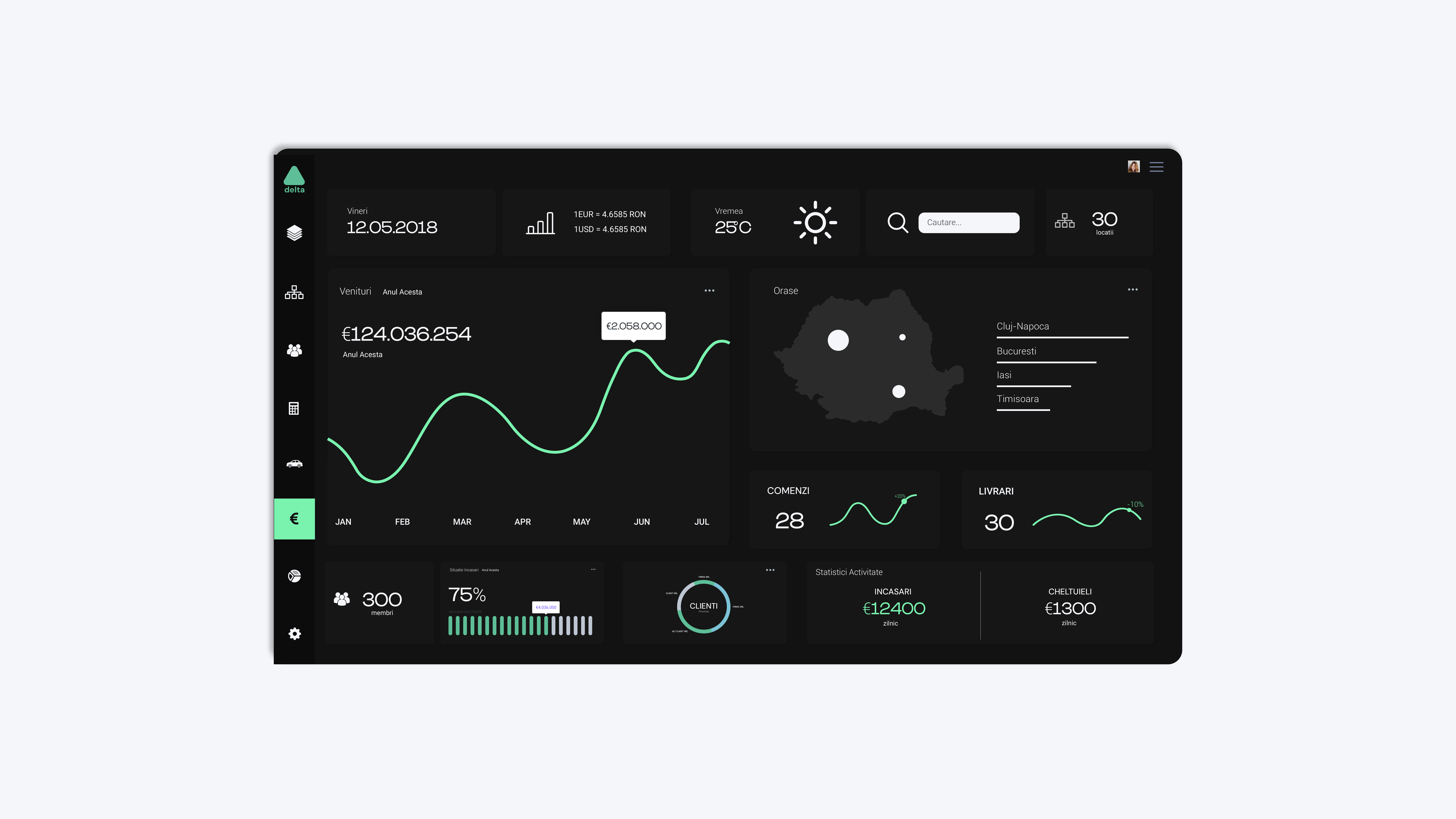
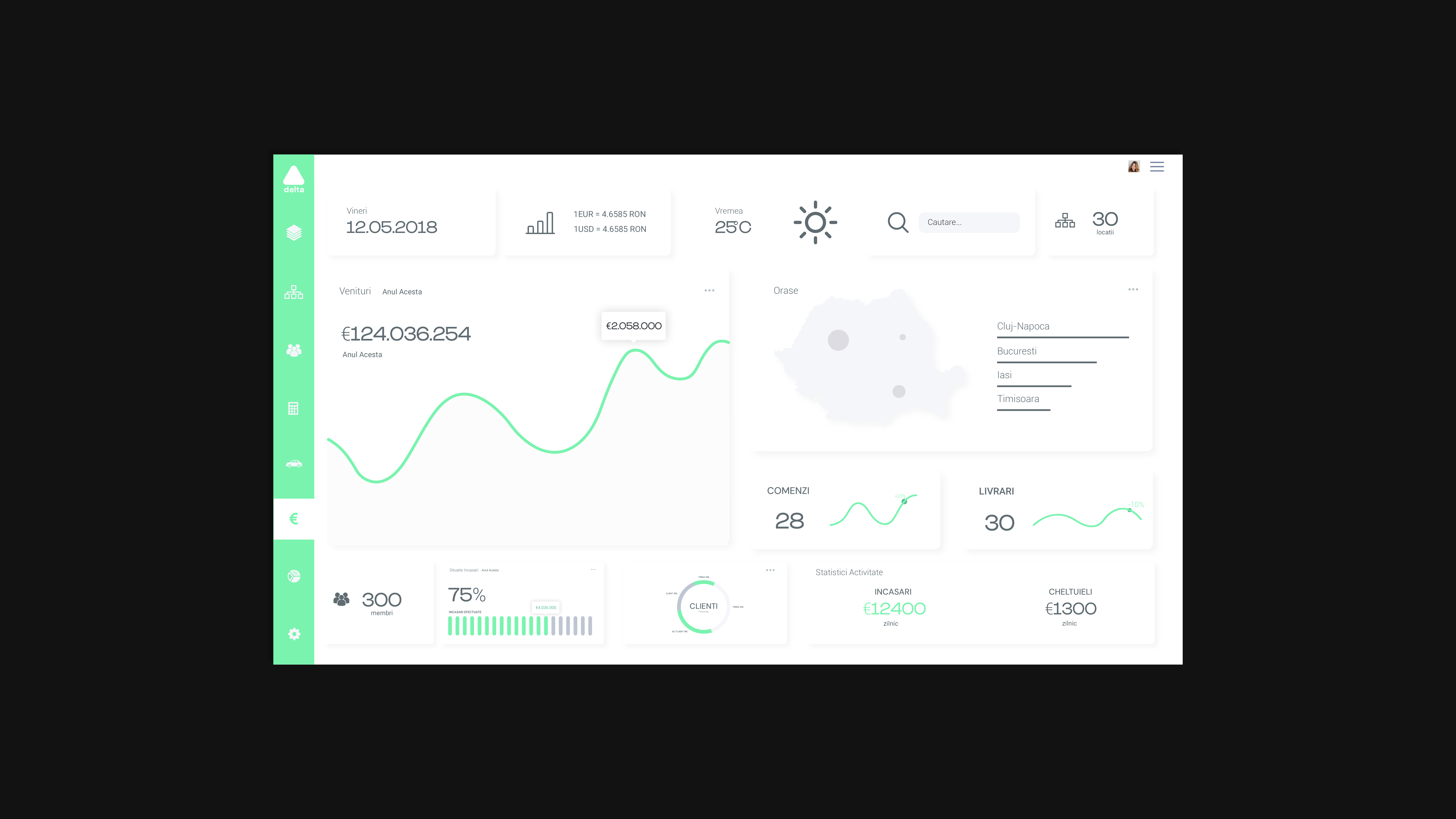
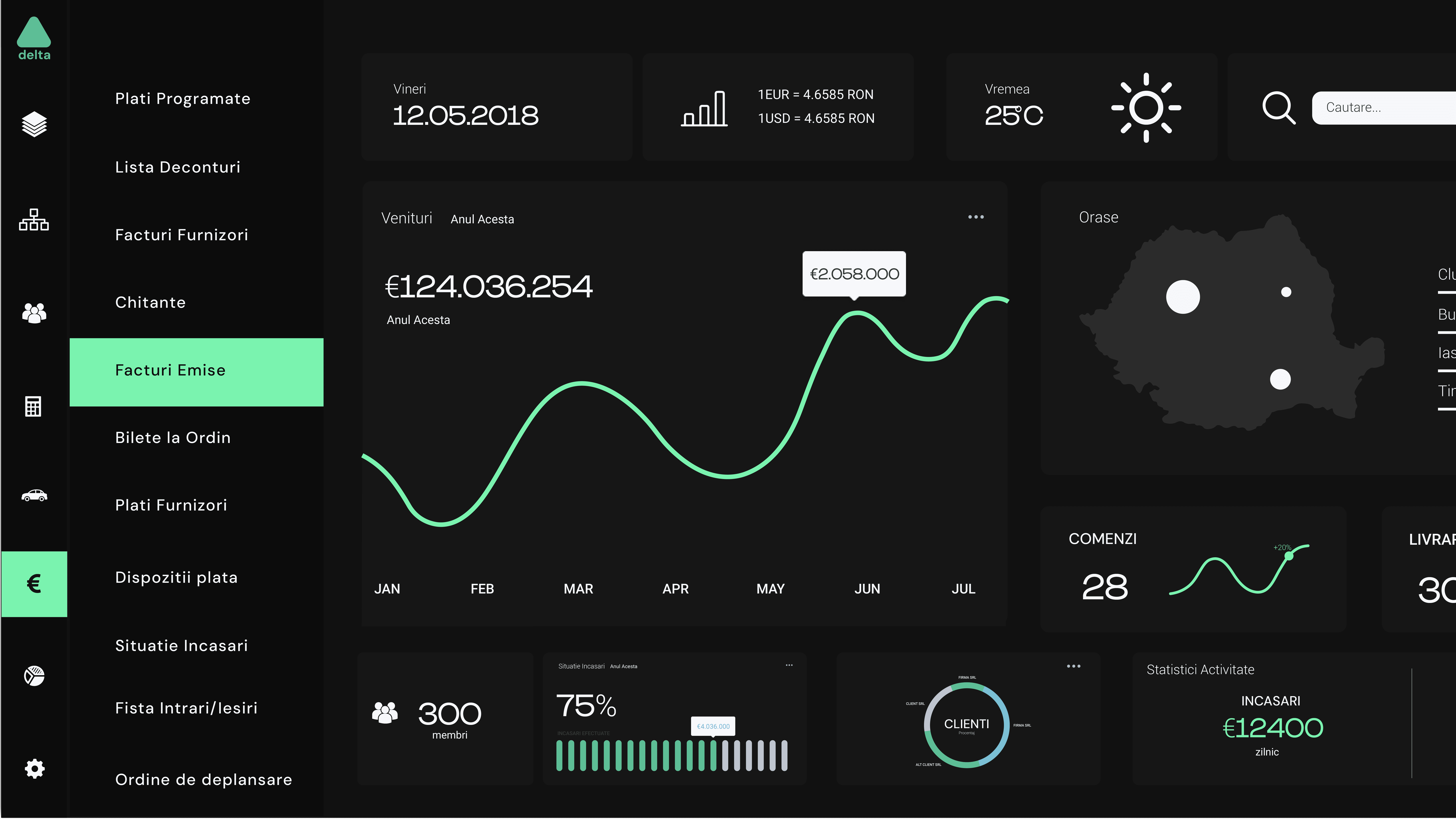
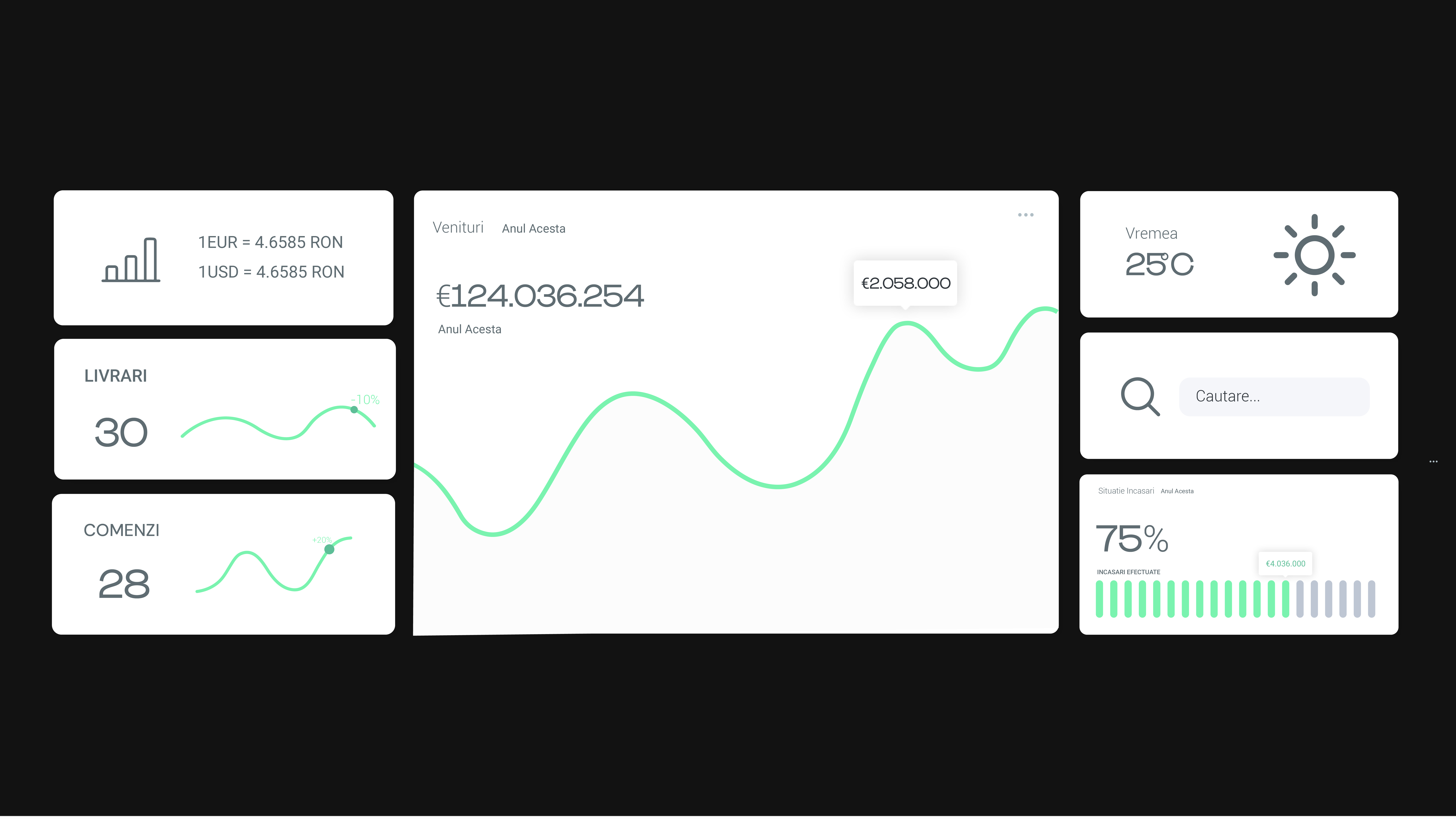
UI Design
Based on my prototypes, I proceeded to create the graphic for the app. The challenge here was to create a highly functional and clutter free workspace while keeping everything easily accessible all throughout the app. This was largely obtained by using icons instead of text, drop down menus and a slick sliding side navigation, along with other UI elements commonly used for organizing. While working on the UI elements I used high fidelity prototypes to repeat some of the previous test in order to insure that the design choices I made do not interfere with the functionality and usability of the original wireframes.
Explore More
Explore More
Explore More
Explore More
Oresi Energy – Brand Identity Case Study
Magno – UI Development Case Study
Explore More Work
Alera – Brand Identity Case Study
Sogvia – Brand Identity Case Study