Nordic Upgrade – Marketing Management SaaS
Year
2018/2023
Industry
SaaS/Tech
Description
Nordic Upgrade is a SaaS solution that helps businesses manage their marketing campaigns and extend their reach by tracking their ads and interaction. UX case details below.
Product & Goal
Note – Large parts of this case study and a number of details are missing due to NDA related limitations
Product
Nordic Upgrade develops a plugin that helps companies with their marketing efforts.
Main Problem
The product was meant to serve both B2C and B2B channels. In terms of the user experience design, this posed a number of difficulties as the app should be simple enough for a small company owner to successfully and easily use and yet sophisticated enough to prove itself worthy of a corporate environment.
Solution & Strategy
Because the company had a number of already existing clients, all working in B2C channels, I proposed a strategy that involved starting with a MVP that serves this particular category and adding a B2B update later on. An agile methodology best fitted the situation because it allowed a less expensive initial phase and a lower degree or risk to be undertaken.
Market research and user personas
Market research
The first step was to research the market for similar existing apps or services. Studying the competitors allowed a better understanding of the environment and provided clues to what improvements could be made and how we could add uniqueness to our product.
User Personas
I set up a group session with the stakeholders to discuss the possible profiles of the users. After discussing the issue, we decided on two different personas: one representative of the B2C user and one representative of the B2B component. For this stage only the B2C persona was needed but having the other one proved useful because it helped put the general strategy for the product into perspective early on.
Brand Identity
Once the target audience was established, it was time to create the brand identity. I chose to do this early on in order to insure brand consistency all throughout the lifecycle of the product, providing support for the agile strategy.
Features
Features
Since the strategy was to get a MVP rolling, there wasn’t a big issue selecting features. A simple pairwise comparison proved very effective in highlighting a hierarchy among all the possible features for this stage.
Tutorials
The initial research revealed that a complicated product like the one in question would draw great benefits in having a tutorial system gradually teaching the user to use the app and get accustomed to its features. This both increased the likeliness of conversion and decreased the likeliness of abandonment.
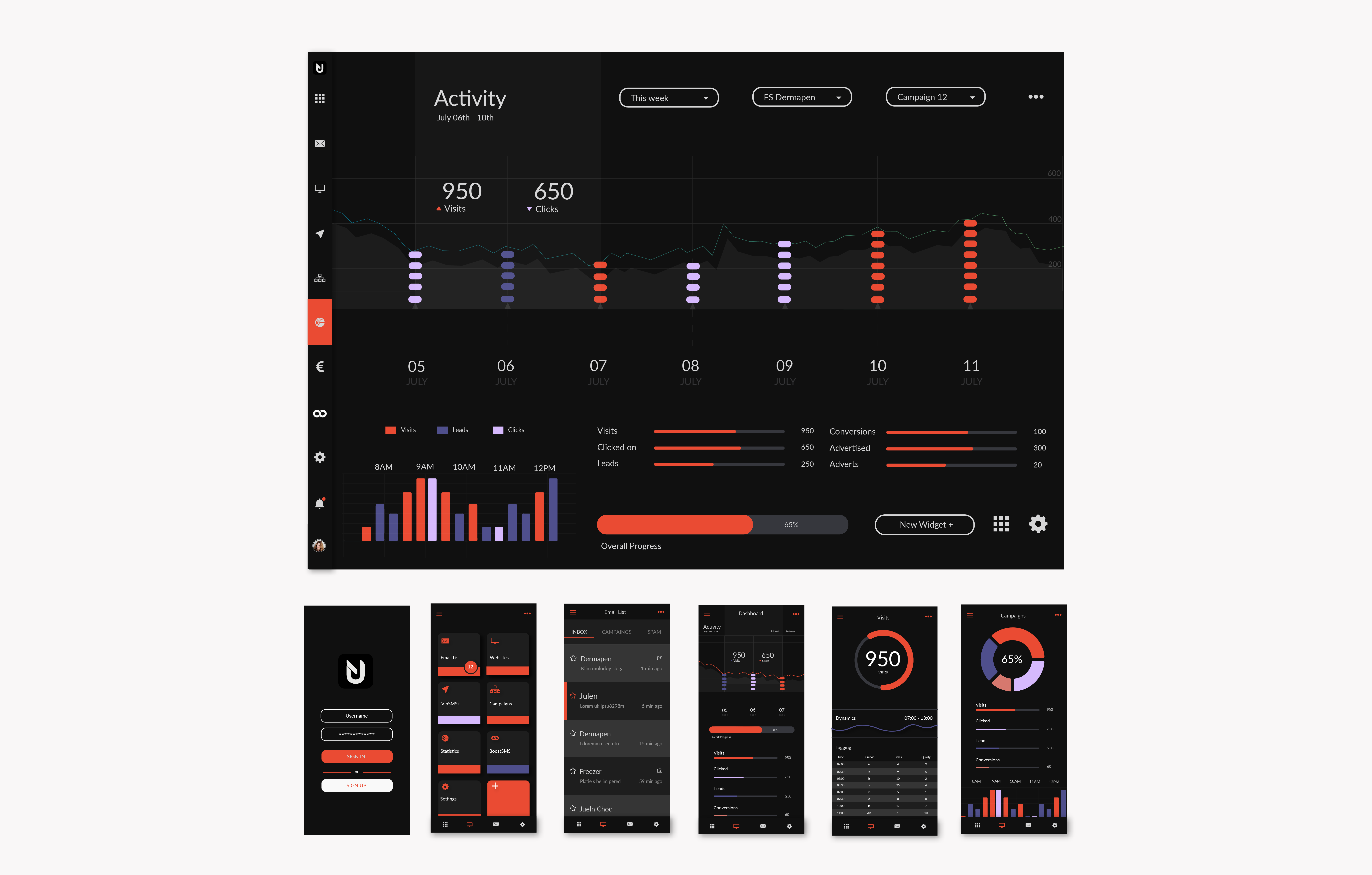
Wireframes, Userflows & UI
Wireframes, Userflows & Mockups
I created some low fi wireframe and userflow schemes to serve as a basis for a prototype.
Prototyping and Usability Testing
I created a medium fi prototype based on the wireframes and set up some tests. The tests were done online using a testing service. I asked the users to perform a sequence of actions and record their screen and thoughts.
UI
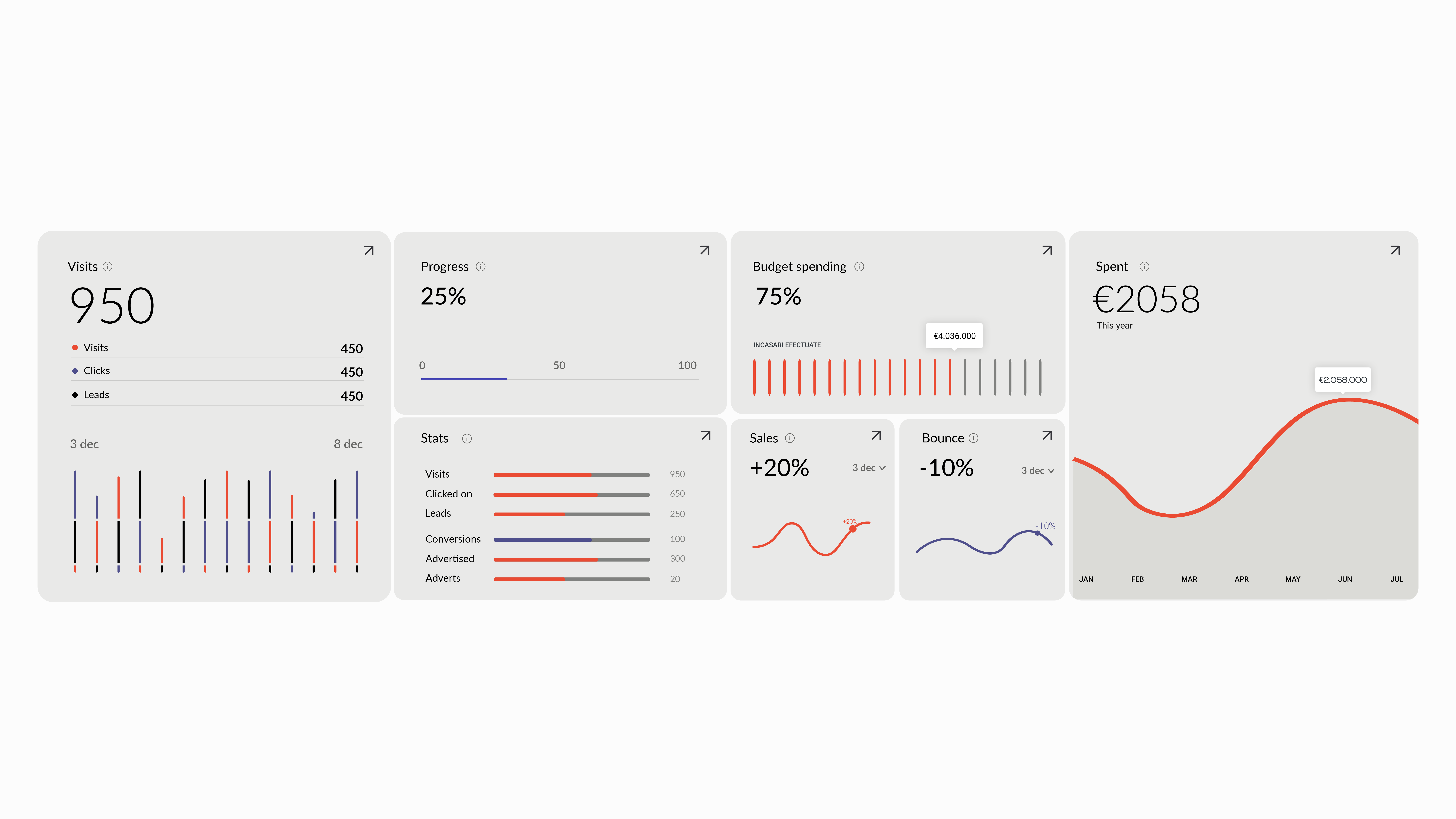
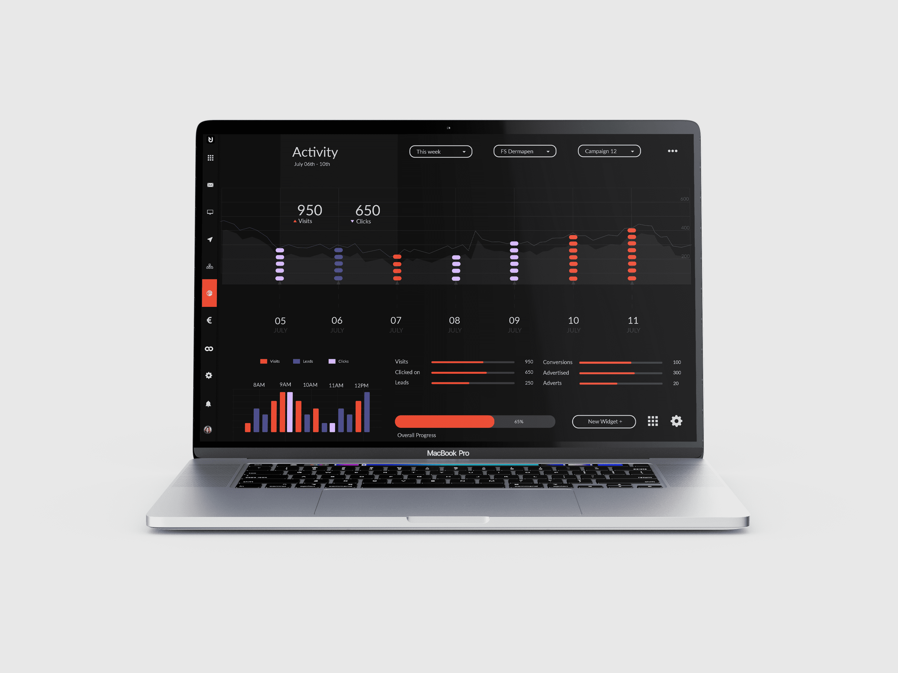
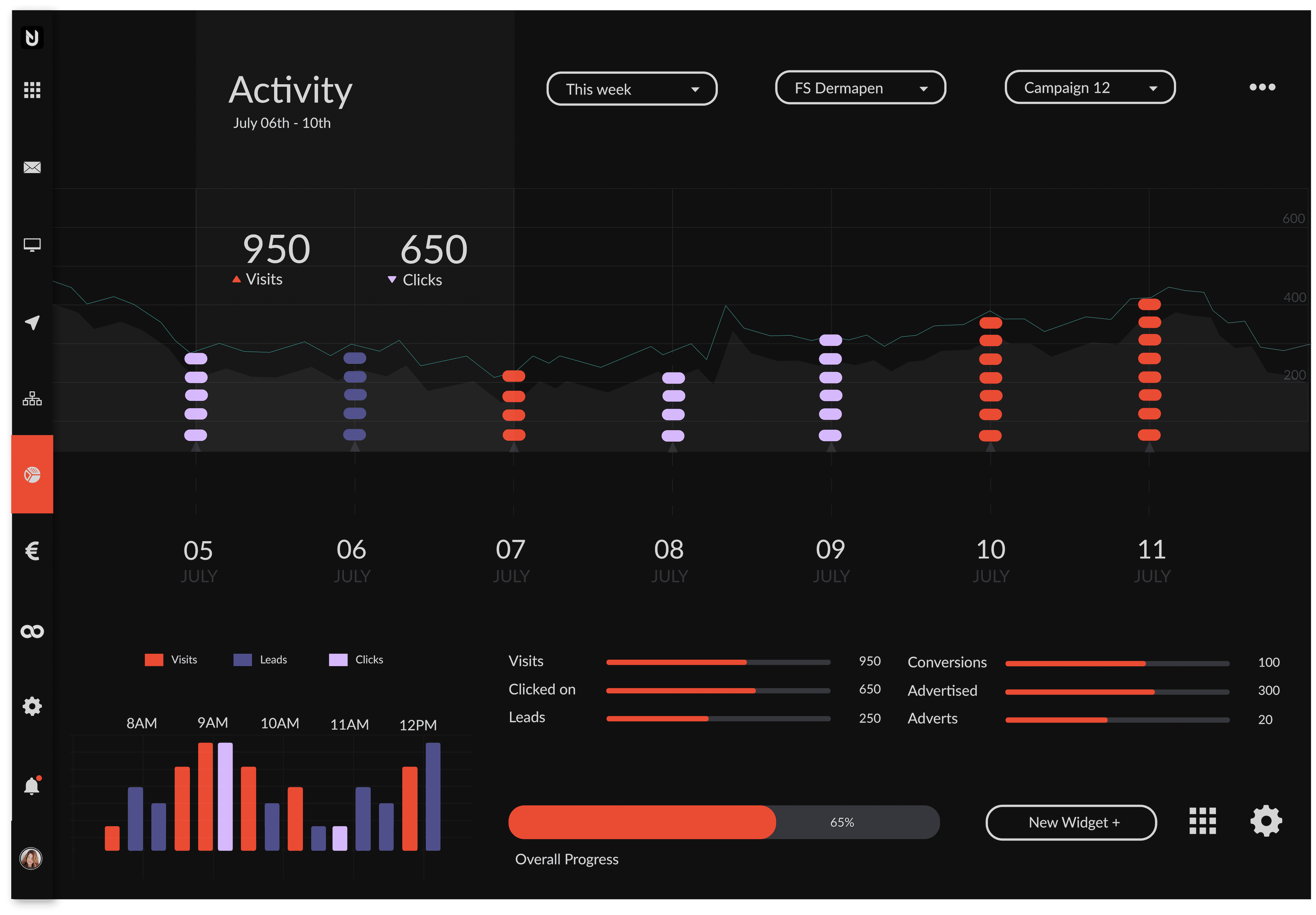
According to the initial research, the product would benefit from a gamification system but not enough to justify allocating budget resources to it, so in the UI phase I strived to design all the elements to mirror gamification systems and provide incentive for continuous use of the app.
UX Cycle
Revisiting initial UX/UI decisions
Observation of larger scale use revealed potential improvements to further client satisfaction and efficiency. Such improvements included focusing on only some specific metrics, including info tool tips, allowing more flexibility zooming the information load in and out as well as allowing edits of the campaign materials inside the dashboard. They were implemented in a newer and refreshed UI that also introduces some visual UI choices more appropriate with newer trends.
Explore More
Explore More
Explore More
Explore More
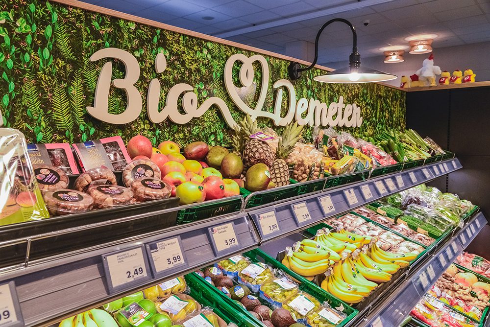
Edeka Berlin Local Market Web Presence
46 Degrees – Brand Identity Case Study
Explore More Work
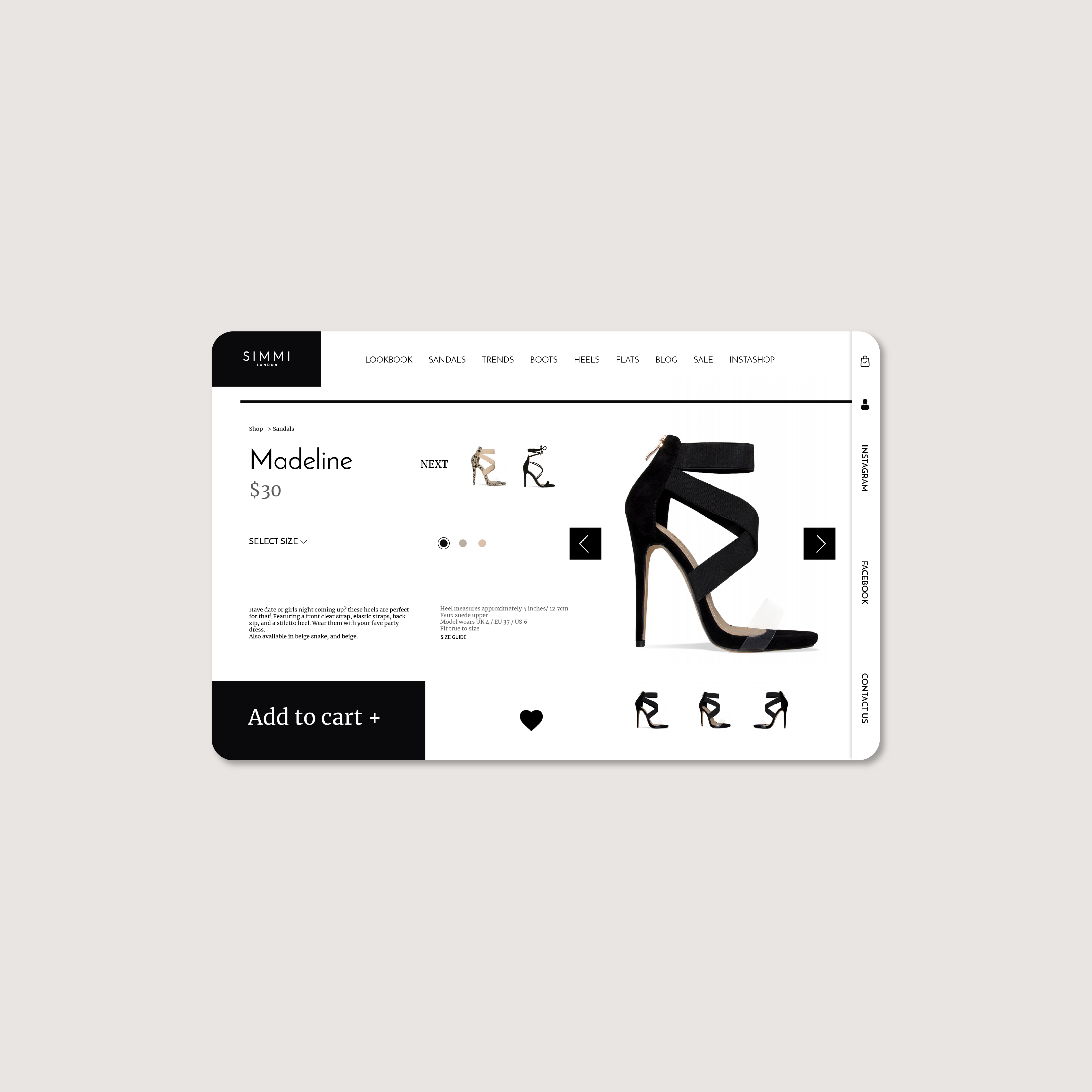
Simmi – Ecommerce UX Interaction Case Study
PulseFit – Brand Identity Case Study